

Achieving excellence and efficiency requires mastering the right tools in Quality Assurance (QA). Today, there are more than a hundred different QA tools available, making the selection process challenging.
It has been 35 years since Dr. Kaoru Ishikawa invented the seven basic quality tools to revolutionize factory worker training. These tools and a wider range of other powerful tools are now widely used in the automotive industry, engineering, and other industries, such as the life sciences. They are a valuable asset for organizations seeking to improve efficiency and quality.
This article explores a collection of the twelve most common quality tools designed to empower you to conduct root cause analysis, streamline processes, and maintain the highest standards in your projects.
But before diving into these indispensable instruments that every QA should have in their toolkit for making informed decisions, it's crucial to understand their significance in risk assessment.
Quality tools and risk assessment
Quality risk management is a non-negotiable requirement to comply with ISO 13485 and 21 CFR 820. Yet, every year, life sciences companies face warnings from regulatory bodies, such as the FDA in the U.S., the EMA in Europe and MHRA in the U.K. Warnings can lead to import alerts, and that’s when products and medicines get pulled off the shelves or never even reach them, ultimately depriving those that need them most.
To prevent such a scenario from unfolding, bottlenecks of non-conformities need to be addressed as soon as possible. To resolve them, regulatory agencies unite before the ICH (The International Council for Harmonisation of Technical Requirements for Pharmaceuticals for Human Use) to work together in following common guidelines (e.g. Q7, Q8(R2), Q9, and Q10 ). Despite their best efforts though, non-conformities just keep accumulating.
The cause? Failures in the quality management processes of organizations. And the main reason underpinning that is poor risk assessment and management.
In order to improve their risk management strategy, life science organizations around the world, especially those in healthcare, turn to several different quality tools. This helps them to uncover the underlying chain of events (or causes) that result in their non-conformities.
But remember, Quality Risk Management doesn’t end with a score; it should feed directly into investigation depth, action planning, and long-term prevention. This CAPA guide shows how to connect risk assessment to corrective and preventive actions in a structured, regulator-aligned workflow.
The 7 basic quality tools by Kaoru Ishikawa + bonus tools
In 1974, Dr. Kaoru Ishikawa, a Japanese engineering professor, published the book Guide to Quality Control. This book became the best self-study guide for training factory workers in quality control techniques.
Dr. Ishikawa developed the seven basic quality tools to assist quality professionals in conducting root cause analysis and implementing process improvements.
Generally speaking, Dr. Ishikawa categorized data collected into five groups based on their purpose: data to aid in understanding the actual situation, data for analysis, data for process control, regulating data, and acceptance or rejection data.
In this section, we will simplify the tools classification into two categories: tools for data acquisition, and tools for data analysis.

Case study:
Take, for instance, a pharmaceutical production process in which you collect the percentage of defective drug tablets. Using a reasonable amount of data (100 measurements), you find that the defect rate is high at 0.31%, while the acceptable defect tolerance is 0.1%.
The goal is to identify the root causes of the high defect rate and implement process improvements to bring the defect rate within acceptable limits.
Here is a look at the theory behind the QA quality tools, as well as how to apply these tools.
Tools for data acquisition
1. Check Sheet
A check sheet is a structured table with rows and columns that allows for easy and accurate data gathering. Data collection can be both quantitative or qualitative data.
It is useful for listing check-up confirmation checks, product defects, location defects, and other quality defects on the left-hand side, and then providing information on the right of each of the topics, such as the frequency of the problem occurring and its severity.
Check sheets are useful for collecting data on frequency distribution for histograms and other charts, and detecting trends. They are also used in internal audits and process reviews. Data collected using a check sheet can be used for further research using a Pareto Chart or other quality tools.
For example, there are check sheets for the production process, defective items checks, defective cause checks, etc.
There are other types of check sheets: confirmation, maintenance, sampling, etc.
How to create a Check Sheet
- A check sheet can be used for a variety of purposes. There is no standard format.
- It is more flexible than a checklist and can be tailored to the specific data collected.
- Establish problem statement and objective. Decide what is the purpose of the check sheet. What is the problem to observe?
- Identify what data should be collected. List key process variables.
- Establish who will collect the data, when, how often, and for how long.
- Create a visually appealing check sheet that displays data that reveals underlying patterns without requiring complicated calculations.
- Establish data categories and label them in the check sheet.

2. Histogram
A histogram is a bar graphical representation of the frequency distribution of data. It displays data by grouping any number within a given range that is grouped into classes. Classes are plotted along the x-axis, with the height of the bars showing the number of data points (frequency) that fall into each class.
A histogram helps to visualize how often each number in a set of data occurs across a continuous range of values.
How to create a histogram
- Determine the number of observations (N).
- Collect the data in a table (see table 1).
- Record the largest value (XL) and smallest value (XS).
- Calculate the range interval of the data as follows: (R=XL-XS)
- Calculate the number of classes (or bars). Use Table 3. For example, select K between 7-12 classes (K) for the number of observations (N=100).
- Select the width of each bar (class interval). Divide the range (R=XL-XS) by the number of classes (K). For example, h=(XL-XS)/8=0.07/8=0.09. This class interval, h, will be used as the horizontal graduation unit for the histogram. To make the class interval easier, round the provisional width to a convenient number, for example, put it at h=0.1. It defines the thickness of the bar.
- Select class boundaries so that classes do not overlap. For example, 0.280-0.289, 0.290-0.299, 0.300-0.309, and so on.
- Determine the number of observations in each class (table 2).
- Draw, scale, and label the x-axis and y-axis.
- Draw the vertical bars for each class. The height of each bar equals the frequency of each class. The width of each bar should be equal.


Tools for data analysis
3. Cause and Effect Analysis (Fishbone Diagram)
Popularly known as an Ishikawa Diagram, Fishbone diagram, herringbone diagram, Fishikawa diagram, or cause-and-effect diagram It is a visual diagram that breaks down a problem into smaller, more manageable pieces; the causes of events. It’s often used in manufacturing and product development to lay out the different key characteristics, key process parameters, and steps in a process, demonstrate where quality control issues might arise, and determine which resources are needed at certain times.The diagram resembles the skeleton of a fish, with the final problem or effect at the fish head and the potential causal factors represented by the fishbones. Each bone belongs to a cause category:
- Materials (raw materials)
- Methods (processes)
- Machines (equipment)
- Measurement (data collection)
- Manpower (people)
Other categories can be included, e.g. environment (external conditions).
It is very useful in brainstorming sessions and organizing the various factors that could contribute to an issue, making it easier to identify the most likely root causes.
How to create a cause-and-effect diagram
- Develop a problem statement.
- Draw a broad arrow from the left side to the right side. Place the problem at the head of the fishbone diagram.
- Determine major cause categories. Manufacturing teams often use the 5 M’s: man, machine, materials, measurement, and methods.
- Prepare a cause-and-effect diagram. Place major categories in the main bones or branches of the fishbone diagram.
- Brainstorm causes. Make a list of possible causes in each category branch that could contribute to the problem.
- Put causes on the diagram. Onto each of these branch items, write in the detailed factors which may be regarded as the causes. These will be like small bones or twigs. Continue the process until the diagram fully shows the causes of the effect or problem.
- Identify the most likely causes. Review the diagram. Identify the most likely root causes that contribute to the problem. Use the info to further investigate or analyze.
A practical example of Fishbone Diagram:
Risk:
Product defects in the pharmaceutical manufacturing process
Possible causes in 5Ms categories:
- Manpower:
-
- Insufficient training of operators
- Inadequate staffing levels
- Poor communication between operators and responsible persons
- Materials:
-
- Poor quality raw materials
- Incorrect storage conditions
- Supply chain issues causing variations in the manufacturing process.
- Machine:
-
- Equipment malfunction
- Poorly maintained machinery
- Inaccurate calibration
- Inadequate automation
- Methods:
-
- Inadequate process documentation
- Inefficient process design
- Lack of process monitoring
- Measurement:
-
- Inaccurate testing procedures
- Insufficient quality control checks
- Quality control and testing non-compliant with regulatory standards

An Ishikawa (Fishbone) diagram is a type of cause and effect analysis used in Risk Assessment.
4. Pareto Chart
A Pareto chart is a type of bar graph that displays the relative frequency of defectives, by height in descending order, with the most frequent item category on the left of the x-axis, to the less frequent item category on the extreme right. The rest of the items are arranged by order of magnitude.
The left vertical y-axis shows the number or percentage of defective items for each defective category. In the right vertical y-axis, the percent of composition is shown for each defective item over the total number of defective items.
The bar chart is commonly overlapped with a line graph that represents the cumulative total of the number of defective items for each defective item.
The Pareto chart is based on the Pareto principle, also called the 80/20 rule, which states that approximately 80% of defects or problems are caused by 20% of the causes.
It is used to prioritize problems or opportunities based on their relative impact. Using this chart, you can identify the most important factors among many in a set. This helps to prioritize and focus efforts on the most critical issues that account for most problems.
How to create a Pareto chart
- Identify what categories to use to group items.
- Decide on the period of time your graph will cover: one week, two weeks, one month, three months, etc.
- Decide what measurements are appropriate: defective frequency, cost, time,
- Collect data and record the category each time.
- Determine the total frequency of occurrence for each item.
- Draw the graph: x-axis and two y-axis (left and right), with the proper units.
- Compute the cumulative totals. Add the frequencies and form a running total. On the x-axis, set the categories or causes in descending order by frequency of occurrence. Write the most important item first, then the next most important, and so on, so the most frequent defective item is shown on the far left.
- Draw in the bars. The height of each bar will correspond to the value on the vertical axis (y-axis).
- Draw the cumulative total lines. Draw a percentage scale at the right y-axis. The 100% point is at the height of the overall cumulative total. Mark the percentages at 80%, 60%, 40%, and 20%. Draw cumulative total points at the right edge of each bar and at the cumulative total height for each class. Connect the points, and plot a line graph.
- Apply the 80/20 rule. Draw a horizontal line from the 80% mark on the right axis until it touches the cumulative total line. Then, at this point, draw a vertical line to the x-axis. Approximately, 20% of the categories of causes usually account for the majority of the problems (80% of problems).

5. Flowchart
A Flowchart, also called a Flow Diagram, is a visual representation of a process series of steps taken to transform inputs into outputs- that shows the relationship among tasks, such as a process working map
Flowcharts are used to define and understand processes. They help you identify critical points in the process where problems arise and where you need more information. Visual representations of procedures are equivalent to written instructions.
How to create a Flowchart
- Outline the process purpose -what the process is for-, scope -starting and ending points-,, inputs, and outputs. Title the process flow diagram.
- Find out what is moving through the process and the level of detail.
- List the process steps in chronological order.
- Identify the process owner, customers -recipients of outputs-, and internal or external suppliers.

6. Control Chart
A Control Chart, also called a Shewhart chart or process control chart, is a graph that is used in statistical process control (SPC) to monitor and analyze the stability of data points at specific intervals, to identify variations and trends, for process performance
Control charts have three types of lines to indicate acceptable variation levels:
- Central Line (CL) (x̄, mean value), that represents the average or mean of the data.
- Upper Control Limit (UCL), typically is set at three standard deviations above the CL.
- Lower Control Limit (LCL), which typically is set at three standard deviations below the CL.
These lines indicate the dispersion of data and let us know when an abnormal situation occurs. A change in the x̄ value for the process being measured will result in an abnormality on the x̄ control chart.
Note that UCL and LCL are not specification limits. Specification limits are established outside the process.
When a process is in a controlled state, all points lie within the control limits, and the point grouping does not form a particular form.
There are other characteristics to consider that are out of the scope of this article: runs, trends, periodicity, and hugging.
How to create a Control chart
- Determine the process parameter.
- Collect more than 100 data points, and put them in sub-groups: date, time periods, lots, etc.
- Determine the sub-group size and frequency. The number of samples in a specific sub-group is the size of the group, represented as n.
- The number of sub-groups is represented as k.
- Record the data on a data sheet.
- Compute the average or mean value (x̄), and the range (R) for each sub-group. The range (R) = x (largest value) + X (smallest value).
- Calculate the overall x̄: total the mean values for each sub-group and divide by the number of sub-groups (k).
- Compute the average value of the Range: total R for all groups and divide by the number of k.
- Compute and control limit lines UCL and LCL.
- Construct the control chart. Draw the control lines and the numerical values. Draw the CL as a solid line, and the limit lines as dotted lines.
- Average control chart: In one chart, plot out the sub-group numbers on the x-axis, and the x̄ values on the y-axis.
- Range control chart: In another chart, plot out the sub-group numbers on the x-axis, and the R values on the y-axis.
- Circle all points that exceed the control limit lines, UCL and LCL, to distinguish them from the others.

7. Scatter Diagram
A Scatter Diagram, also known as a scatter plot or scatter graph, is a diagram that shows the relationship between two variables for each point.
One axis (x-axis) is used for one variable, and the other axis (y-axis) is used for the second variable. Plot points show the intersection between each variable.
Scatter diagrams are used to study possible cause-and-effect relationships between two variables: cause/effect relationships, cause/cause relationships, and effect/effect relationships.
Several types of scatter diagrams can illustrate the type of correlation: positive correlation, negative correlation, or no correlation.
How to create a Scatter Diagram
- Define the problem.
- Collect 50-100 paired samples of data whose relationship you wish to investigate, and report on a data sheet.
- Draw the x-axis and y-axis of the graph. Place one variable on the x-axis, and the other variable on the y-axis.
- Plot a point at the intersection of each pair of variables.
- Analyze the scatter plot.

8. Brainstorming
Brainstorming is a qualitative tool that is used in quality improvement projects to generate ideas. It focuses on gathering information through open-minded conversations and thinking, solving problems, and coming up with solutions around a subject matter.
How to do a brainstorming session:
- Define the problem or challenge the brainstorming session will address and establish objectives.
- Establish boundaries and define the scope in order for participants to understand the limitations and constraints, so they can be more effective in achieving the objectives.
- Create the agenda.
- Prepare the materials, tools, or information participants will need in the session.
- Create a team (5-10 participants) of subject matter experts, and staff involved in the topic.
- Assign a facilitator experienced in leading brainstorming sessions.
- Establish the rules.
- Conduct the brainstorming session.
- Document the outcomes of the session: ideas, plan, etc.
9. The Five Whys
5 Whys is a simple, iterative, problem-solving technique that identifies the underlying cause of the problem by repeatedly asking "why" at least five times until it becomes clear that there is a root cause beneath the surface.
This technique helps teams understand the deeper issues that contribute to failures or problems.
5 Whys is widely applicable in various contexts, including manufacturing, software development, healthcare, etc.
How to do Five Whys
- Consider applying the 5 Whys technique as a team. Invite subject matter experts and individuals affected by the problem.
- Define the problem statement.
- Describe the conditions under which the problem occurred in detail.
- Identify the people affected by the problem and the impact on the process.
- Ask Why multiple times -at least 5 times-, to uncover the real root cause of the problem.
- Instead of making assumptions, base your questions on facts and data. Don't focus on the symptoms. Concentrate on the process, and not on individuals.
- Identify if there are any gaps or inconsistencies in the answers. Ensure the conclusions are logical and supported by evidence.
A practical example of Five Whys:
Problem:
Out-of-specification results in the Quality Control department.
Five Whys process:
- Why did the test results show an out-of-specification (OOS) result?
Because the concentration of a specific ingredient is higher than the specified limit. - Why was the concentration of the ingredient higher than the specified limit?
Because an incorrect formulation was used during the manufacturing process. - Why was an incorrect formulation used?
Because there was an error in the batch formula provided to the manufacturing team. - Why was there an error in the documentation?
Because the person responsible for preparing the documentation did not have access to the most up-to-date specifications and was not included in the change control process. - Why didn't the person responsible have access to the most up-to-date specifications and was not included in the change control process?
Because there was a lack of communication in the change control process between the Quality Control department, Regulatory Affairs department, Manufacturing department, and the documentation team.

Asking the ‘5 Whys’ is useful in determining the root cause of an issue during Risk Assessment.
10. Failure Mode Effect Analysis (FMEA)
Failure Mode and Effects Analysis (FMEA) is a risk management tool intended to define, identify, prioritize, and eliminate known and/or potential hazards and risks in a system, design, or proces. The goal is to eliminate the failure modes or reduce their risks through mitigating actions.Risks are everywhere. To perform a risk analysis we need to answer three questions:
- What can go wrong?
- What is the probability of it happening?
- What are the consequences?
FMEA prioritizes failures according to how serious their consequences are, how frequently they occur, and how easily they can be detected.
Mitigating actions are applied to minimize the impact or severity of the risk, prevent the causes of risk from occurring, or detect the risk early in its lifecycle to minimize the effect.
How to do FMEA
- Define the scope and purpose.
- Determine if the FMEA is for a system, design, process, or service.
- Consider applying the FMEA as a team in a brainstorming session. Invite subject matter experts and all relevant stakeholders.
- Create a block diagram and/or a process flowchart to provide an overview of the relationships and interactions of the processes, systems, components, and services.
- Collect the data on the failures and categorize them (failure modes).
- Identify core components of the FMEA. Fill in the FMEA form. A proposal of columns are:
- Potential failure modes or risk/hazard
- Potential failure effects
- Potential causes of failures
- Current process controls
- Severity (consequence)
- Probability (likelyhood of occurrence)
- Detectability (optional)
- Priority Number (RPN): Severity x Probability x Detectability
- Mitigating action
- Revised risk level.
- Determine the severity rating for each effect. You can rate severity on a scale of 1 to 3, or 1 to 10.
- Determine the probability rating for each effect. You can put probability on a scale of 1 to 3, or 1 to 10.
- Determine the detectability rating for each effect. You can rate detectability on a scale of 1 to 3, or 1 to 10.
- Intensity current process controls for each risk.
- Calculate RPN for each failure mode.
- Take corrective actions that mitigate the highest RPN risks, that go beyond a risk threshold you have previously established.
- Recalculate the RPN after actions are implemented. Ensure RPN is reduced below the acceptable level.
A practical example of FMEA:
Problem:
Risk of deviations in electronic management systems
FMEA process:
- Define the scope and purpose of FMEA
- Determine potential issues
- Determine core components of FMEA: potential failure modes, potential failure effects, potential causes of failures, etc.
- Grade severity (consequence), likelihood of occurrence (probability) and detectability, using matrixes
- Rank each failure effect based on severity, likelihood of occurrence (probability). Detectability can be included if applicable.
- Calculate Risk Priority Number (RPN): Severity x Probability x Detectability
- Prioritize each potential issue
- Determine how to mitigate critical risks/hazards to acceptable levels.
-
Revise risk levels as needed.


11. Fault Tree Analysis (FTA)
Fault Tree Analysis (FTA) is a graphical tool utilized to delve into the root causes of system-level failures. It employs a top-down, deductive approach to failure analysis, using Boolean Logic to amalgamate a sequence of lower-level events, thereby discerning the cause of a top-level event, such as a system-level failure.
Comprising "events" and "logic gates," FTA connects these elements to pinpoint the underlying cause of the top undesired event. It presents a more straightforward method compared to Failure Mode and Effects Analysis (FMEA), as it encompasses all potential system failures leading to an undesired top event. In contrast, FMEA scrutinizes various system failure modes, irrespective of their severity.
How to do FTA:
- Clearly state the undesired outcome you want to analyze.
- Break down the top event into specific failures or events contributing to it.
- Create a graphical representation detailing how each event contributes to the top event.
- Identify additional factors relevant to the analysis.
- Assign probabilities to each event based on data or expert judgment.
- Use logic gates to calculate the likelihood of the top event.
- Identify critical paths and assess their impact on the top event.
- Develop strategies to reduce the likelihood or consequences of the top event.
- Confirm findings with experts and stakeholders, and review periodically.
- Record the analysis process, assumptions, and recommendations for future reference.
A practical example of Fault Tree Analysis:
Problem:
Risk of microbial contamination in the drug product
Fault tree analysis process:
The fault tree diagram shows that microbial contamination in the drug product can occur if there are contaminated raw materials (Cause 1 OR Cause 2 OR Cause 3) inadequate sanitation practices (Cause 4 OR Cause 5) AND human error (Cause 6 OR Cause 7) AND environmental factors (Cause 8 OR Cause 9 OR Cause 10) AND inadequate quality control (Cause 11 OR Cause 12 OR Cause 13).
Conclusion:
By analyzing contributing events and potential causes, we can create a fault tree diagram to visually represent the risk using logical gates such as AND and OR. The fault tree diagram shows the top event at the top and branches representing the contributing events and causes leading to the top event.
By using fault tree analysis, pharmaceutical companies can identify critical risk pathways and focus their risk mitigation efforts on specific causes and events. This enables them to implement appropriate preventive measures such as rigorous raw material testing, robust sanitation procedures, proper training and hygiene practices, effective environmental monitoring, and comprehensive quality control protocols to reduce the likelihood of microbial contamination in the drug product and ensure patient safety.
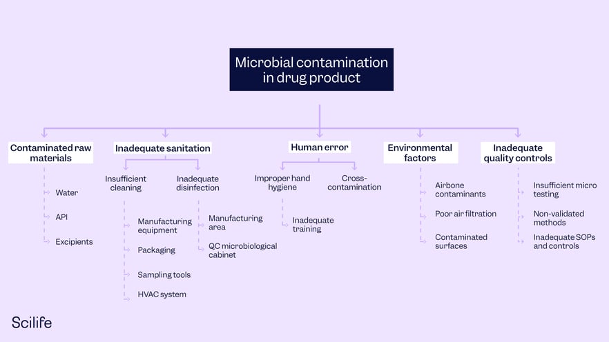
A Fault Tree Analysis example.
12. Risk Ranking
Identified risks are assessed either quantitatively or qualitatively, to ascertain which ones have the highest likelihood of occurrence and which ones have the greatest severity (consequence) of occurrence, this ranks the risks in overall order of importance.
A practical example of Risk Ranking:
Problem:
Streamlining Risk Assessment in Pharmaceutical Manufacturing
Risk Ranking process:
- Identify potential risks/hazards in manufacturing that could impact product quality or patient safety: equipment failures, contamination issues, etc.
- Grade criteria: severity (consequence) of potential harm, likelihood of occurrence (probability), detectability, regulatory impact, etc.
- Rank each potential risk/hazard based on Grade severity (consequence) of potential harm, the likelihood of occurrence (probability), detectability, regulatory impact, etc.
- Calculate Risk Priority Number (RPN) with the above criteria
- Prioritize each potential risk/hazard
- Plan mitigation actions
- Revise risk levels as needed.
- Monitor continuously and reassess frequently
Conclusion:
A risk ranking tool is an invaluable asset in life sciences. It enables systematic risk assessment, prioritization, and mitigation planning, ensuring that critical risks are addressed proactively. By streamlining the risk management process, organizations can enhance product quality, safeguard patient safety, and maintain regulatory compliance in a dynamic and ever-evolving industry.
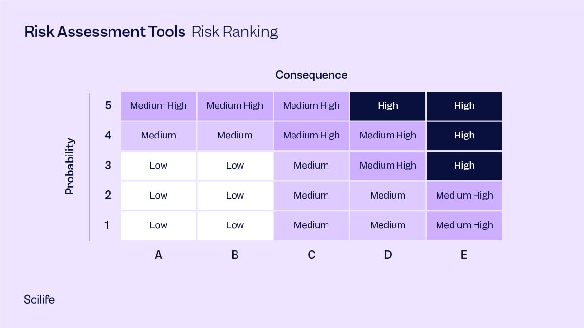
Risk Ranking, taking into account the probability and consequence of each potential risk.
Use quality tools in combination for better results
Using several of these quality tools in combination instead of just one is helpful. For example, using the Ishikawa Diagram to arrive at various causes of a deviation occurrence, and then making it more effective by narrowing down to the root cause using the Five Whys. The Five Whys technique is useful to arrive at the root cause by clearly differentiating it from its associated symptoms. These symptoms can go on to be listed as ‘failure modes’ and causes can be listed as ‘causes’ in FMEA. The understanding from Fault Tree Analysis can then be used for calculating Risk Prioritization Number (RPN) in FMEA. Finally, risk ranking can be performed using the RPN to avoid subjectivity. In the end, all quality tools can be used to strengthen each other. Ultimately, you benefit from cross-functional teamwork and eliminate the risk of subjectivity and over optimistic assessment that can lead to audit failures.
Scilife for robust Risk Assessment and continual Risk Management
Scilife has an intuitive Risk Assessment module that provides handy standardized and pre-filled configurable risk management templates, lets you program periodic reviews with automatic notifications to the right people at the right time to take the right actions, and links to powerful CAPA management and Change Control modules all right within the Scilife platform. It takes care of every aspect of Risk Assessment, requiring the least input from your side.
Discover how Scilife Smart QMS can help you implement Risk Assessment methodologies.
![CAPA: FDA's #1 Most Cited Inspection Finding [Full Guide]](https://www.scilife.io/hubfs/The-ultimate-corrective-and-preventive-action-%28CAPA%29-guide-every-life-science-professional-needs.png)